The long-awaited BT re-brand
Well, it’s becoming a bit of a thing with us writing all about brands and rebranding. But don’t worry, we really don’t think we are experts in this field but every now and then we just see something that we just felt that we have to share.
Yep, and we’ve got excited again this month because BT are rebranding. “Big Deal” we hear you say, but don’t be so hasty, read on.
Well the BT branding history goes back, and I mean way back.
Back in 1980 all the way through to 1991 the BT Logo looked like this:

At which point it went through a refresh and until 2003 it looked like this:
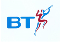
Then 2003 saw the 3rd iteration of the brand to today’s logo which you probably recognise:

Then in 2016 it all started again, and BT decided it needed new look for its now 13-year-old logo as it set out on a journey for a complete rebrand. The idea has been to create a more simplistic brand, symbolising ‘real change’. The result being flat black and white ‘BT’ letters in a circle. Yep.
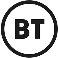
The new BT logo. 3 years in the making it would seem.
However, in as much as the brands have been released and the press are being briefed, there is a note of caution as BT announce that brands are still to be finalised.
Notwithstanding, there has also been an announcement by a spokesperson that new branding will be gradually rolled out towards the end of the summer. As the brand announcement said …… ‘symbolising real change’
So, what do you think? Is it ‘Funky’? A ‘Change Agent’? Or simply ‘Emperors’ new clothes’ – we will leave it to you to decide. For my part I’d not exactly use the word ‘Racy!’
One thing is for sure, it is environmentally friendly in that it saves money on coloured inks.
Let’s just hope BT Sport doesn’t start to broadcast in ‘Black and White’ too as for us that would be one retro step too far?
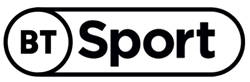
BT Sports gets a rebrand too. Not the most vibrant we’ve ever seen.
Well, it’s becoming a bit of a thing with us writing all about brands and rebranding. But don’t worry, we really don’t think we are experts in this field but every now and then we just see something that we just felt that we have to share.
Yep, and we’ve got excited again this month because BT are rebranding. “Big Deal” we hear you say, but don’t be so hasty, read on.
Well the BT branding history goes back, and I mean way back.
Back in 1980 all the way through to 1991 the BT Logo looked like this:
At which point it went through a refresh and until 2003 it looked like this:
Then 2003 saw the 3rd iteration of the brand to today’s logo which you probably recognise:
Then in 2016 it all started again, and BT decided it needed new look for its now 13-year-old logo as it set out on a journey for a complete rebrand. The idea has been to create a more simplistic brand, symbolising ‘real change’. The result being flat black and white ‘BT’ letters in a circle. Yep.
The new BT logo. 3 years in the making it would seem.
However, in as much as the brands have been released and the press are being briefed, there is a note of caution as BT announce that brands are still to be finalised.
Notwithstanding, there has also been an announcement by a spokesperson that new branding will be gradually rolled out towards the end of the summer. As the brand announcement said …… ‘symbolising real change’
So, what do you think? Is it ‘Funky’? A ‘Change Agent’? Or simply ‘Emperors’ new clothes’ – we will leave it to you to decide. For my part I’d not exactly use the word ‘Racy!’
One thing is for sure, it is environmentally friendly in that it saves money on coloured inks.
Let’s just hope BT Sport doesn’t start to broadcast in ‘Black and White’ too as for us that would be one retro step too far?
BT Sports gets a rebrand too. Not the most vibrant we’ve ever seen.


